Choosing the Right Paint Colors for Your Beverly Hills HomeElevate Curb Appeal And Interior Harmony With Local Color Sense
Introduction
Selecting paint colors for a Beverly Hills home blends aesthetic judgment with local context. Light, light-reflecting hues emphasize architectural detail on sunlit facades. Rich, muted tones can create a sophisticated atmosphere inside garden-facing rooms. The choices made for exterior and interior finishes influence curb appeal, buyer preferences, and the way sunlight interacts with living spaces. The following sections explore practical steps and local considerations for choosing colors that complement the city’s character and each residence’s attributes.
Understanding Local Architectural Styles
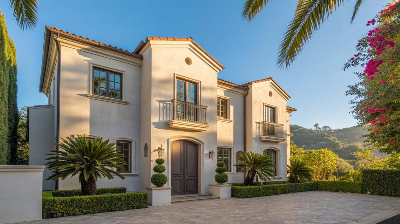
Explanation of Local StylesBeverly Hills includes a range of architectural expressions from Mediterranean villas to modern hillside homes. Recognizing the primary style of a residence helps narrow appropriate palettes. Mediterranean properties often suit warm, earthy tones that echo stucco and clay roof tiles. Midcentury modern houses pair well with restrained neutrals and accent shades that highlight clean lines. Contemporary hillside homes can accept bolder contrasts that read well against distant city views.
Examples And TipsVisual surveys of nearby blocks can reveal color trends that enhance property value. Observing how light falls on stucco versus wood siding at different times of day guides selection. For homes in the Beverly Hills Flats, lighter exteriors soften street presence. In Trousdale Estates, a subdued palette can reinforce the modernist geometry. Consulting a local real estate agent can clarify buyer preferences for a specific neighborhood.
Practical AdviceMatch finish sheen to material — flat for masonry that hides imperfections, satin for trim that benefits from subtle reflection. Consider roof and hardscape tones when planning an exterior scheme. Sample large swatches on multiple walls and view them in morning and evening light before committing.
Assessing Light And Microclimate Effects
Explanation of Light VariationsNatural light in Beverly Hills changes with elevation and orientation. Slopes facing the ocean usually receive cooler afternoon light, while flats can experience strong midday sun that intensifies color saturation. Interior rooms with south-facing windows will show deeper color while north-facing corners appear softer.
Examples And TipsA pale warm gray that looks neutral outdoors may read as cool in a north-facing living room. Rooms with abundant light can support deeper accent walls without feeling enclosed. Shade of nearby trees and reflective surfaces such as glass panels alter apparent hue — test colors on exterior walls near landscaping before painting.
Practical AdviceObserve test swatches at sunrise, midday, and near sunset. Select a palette that adapts to the property’s microclimate rather than a single appearance in one lighting condition. Use lighter tones on smaller rooms to create an airy feel, and richer tones on large spaces to add intimacy.
Coordinating Exterior And Landscape Elements
Explanation of IntegrationExterior color works with landscaping, walkways, and driveway finishes to form a unified presentation. Plants and hardscape materials set a secondary palette that can either contrast or harmonize with the facade. The goal is cohesion between built elements and botanical choices.
Examples And TipsA home with Mediterranean plantings — olive and lavender — pairs well with warm beige or soft ochre. Modern minimal plantings with sculptural succulents complement cooler grays and deep charcoal accents. For properties with stonework, sample paint next to the actual stone rather than a photograph.
Practical AdviceCreate a palette board including roof tile, paving material, and foliage. Prioritize longevity by choosing colors that age gracefully with native plants. Ensure trim and fascia colors frame the main field color without clashing with garden tones.
Selecting Interior Palettes For Flow
Explanation of Interior ContinuityInterior color schemes influence circulation and perceived room relationships. Smooth transitions between rooms create a cohesive flow while intentional contrasts define separate areas. Hallways, staircases, and entryways set expectations for the interior palette.
Examples And TipsA continuous neutral in public areas allows furniture and art to be focal points. Accent colors in formal rooms can reflect exterior hues to create connection with the outdoors. In open-plan layouts, a shared undertone across zones promotes harmony without monotony.
Practical AdviceChoose a primary neutral that appears consistent under varied lighting. Use accent colors on a single wall or in architectural details to avoid overwhelming interconnected spaces. Keep ceiling paint slightly lighter than walls to enhance height perception.
Testing Samples And Mockups
Explanation Of Sampling ImportanceSmall chips rarely convey full effect — larger test areas reveal undertones and interactions with light and finish. Mockups allow evaluation of color against actual materials and furnishings.
Examples And TipsPaint multiple large panels and position them in key locations for several days to observe shifts. Use temporary large-scale swatches on exterior walls to assess curb appeal from street level. Create digital mockups only after physical tests confirm the chosen direction.
Practical AdviceAllow time between applications to observe drying changes. Evaluate colors at different times to ensure a consistent response to morning and evening conditions. Record favorite options and compare them side by side in the setting where they will live.
Choosing Finishes And Sheen Levels
Explanation of Finish SelectionFinish affects appearance and maintenance. Matte finishes hide surface variations and provide a refined surface for formal spaces. Eggshell and satin offer a subtle sheen that resists staining on walls with traffic. Trim and doors benefit from a glossier sheen that highlights architectural detail.
Examples And TipsIn entryways where palm oils and touchpoints are common, satin or semi-gloss is practical. Bedrooms and formal living rooms often suit a lower sheen to emphasize color depth. Exterior trim with sharper details looks crisp with a harder gloss level.
Practical AdviceMatch sheen to function — higher sheen on surfaces that require frequent cleaning, lower sheen where a soft look is desired. Consider how sheen amplifies color intensity and run tests to confirm the intended visual effect.
Working With Architects And Designers
Explanation Of Professional CollaborationArchitects and designers provide perspective on historical context, proportion, and material compatibility. Their experience with local suppliers and vendors streamlines selection and execution.
Examples And TipsA designer can translate personal taste into a balanced palette that aligns with the home’s era. Architects advise on color interaction with new additions — ensuring cohesive transitions between old and new construction. Local professionals often recommend finishes that perform well in the city’s climate and light conditions.
Practical AdviceShare photos and existing material samples early in collaboration. Request full-size mockups and a written palette schedule that lists exact paint codes and finish levels. Schedule a walk-through after initial application to approve touch-ups and adjustments.
Considering Market Appeal And Buyer Preferences
Explanation Of Market SignalsBuyer preferences in Beverly Hills favor refined palettes that support a sense of quality and livability. Neutral fields with thoughtful accents attract broader interest while bold statements can differentiate high-end properties.
Examples And TipsHomes intended for resale often benefit from universally appealing neutrals and subtle contrast for trim and doors. Custom statements in limited areas — such as a powder room or study — can add personality without affecting overall marketability. Consultation with a real estate agent can reveal current local preferences.
Practical AdviceBalance personal expression with market sensibility when preparing a property for sale. Choose durable finishes and neutral backgrounds that allow furnishings and staging to highlight the home rather than compete with color choices.
Managing Color Maintenance And Longevity
Explanation Of Long-Term ConsiderationsFading, chalking, and dirt accumulation vary by pigment and exposure. Exterior colors near busy streets or southern exposures may require periodic refresh. Interior areas with direct sunlight can show gradual fading over long periods.
Examples And TipsLight-reflective colors reduce heat absorption and can slow UV impact on finishes. Selecting high-quality primers and topcoats enhances adhesion and extends the life of the paint. For high-traffic interiors, choose washable formulas to maintain appearance.
Practical AdviceSchedule routine inspections of exterior paint and trim after significant weathering seasons. Keep leftover mixed paint in labeled containers for touch-ups to ensure perfect color matches when needed. Use professional applicators who follow manufacturer preparation and application guidelines.
Coordinating With Local Regulations And HOA Guidelines
Explanation Of Regulatory ContextMany properties in Beverly Hills fall under homeowner association guidelines or preservation standards that specify allowable palettes or finish types. Compliance ensures approvals during exterior alterations and avoids delays.
Examples And TipsReview HOA color charts and architectural review procedures before painting the exterior. For historic properties, consult preservation guidelines to select period-appropriate hues and finishes. Permit processes for major exterior changes may require color samples with applications.
Practical AdviceObtain written approvals when required and retain documentation for future transactions. When proposing a unique scheme, present clear mockups and rationale to boards or committees to facilitate acceptance. Work with local professionals familiar with municipal and HOA practices to streamline the approval path.
Paint with Purpose in Beverly Hills
Choosing the right paint palette can elevate curb appeal, complement architectural details, and boost the resale value of your Beverly Hills, CA home. For tailored color guidance and local market insight, visit carolinakramer.com to see how expert staging and design can work for you. With the right hues, your property will not only reflect your style but also attract discerning buyers. Contact us today to schedule a complimentary color consultation and start transforming your Beverly Hills, CA residence.